
A bit of a break from A Fortnight of Fiffe, today.
It's been years now since Frank Santoro introduced the concept of fusion into comics critics' collective lexicon, providing a label for the amalgamated, modern, worldwide artistic sensibility exhibited by the newest generation of comics' creators. Influences from eurocomics, manga, the undergrounds, the South American cartoonists, the Filipino cartoonists, old newspaper masters, and more all able now to be read and consumed and processed by the up and coming young fucks. The young fucks under examination here are some of the three biggest mainstream-focused-indie guys out there at the moment. All three with multiple Diamond-distributed hits, all three with a pop-genre-with-a-twist-and-a-half narrative style, and all three with cultivated art approaches that fall fully under the "fusion" label.
Brandon Graham, James Stokoe & Giannis Milonogiannis, the clear-line texture-men.
These three are, with others such as James Harren, among the premier new rulers of the North American action market. And have in fact been so for years now. The unifying factor between the three, the line of best fit as it were, is the clear line and the texture. The shapes and the feels; the reconciliation of the inherent contradiction. For lingne claire traditionally minimizes textures, relying on shapes and spaces and visual relationships, rather than the structured noise that is texture. To combine the two must be madness, surely?
Or is it actually genius?
Graham, Stokoe and Milonogiannis all use a considerable amount of the single-width line, with Milonogiannis and Graham using nearly all single-width lines (or lines that vary so little, they appear to be same-width to the casual reading eye), these days . Stokoe continues to use brush pens, markers and thicker lines, however, though his work is of course filled with that energy-charged obsessively repetitious single-width pen stroke of his. There are artistic arcs to all these guys of course, and each is absolutely worthy of closer individual examination unto himself, but for now I'd just like to discuss the factors that unify them and how those factors relate to the reading of a comics page and to image-making in general.
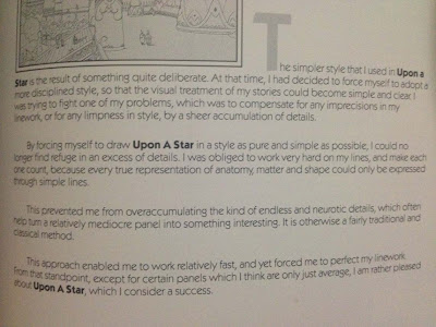
In the Afterword to Moebius' Upon A Star he discusses his conscious transformation of style, toward the sparer, cleaner look seen in much of the Aedena Cycle (especially that first book). I'll quote from that afterword:
“The simpler style that I used in Upon a Star is the result of something quite
deliberate. At that time, I had decided to force myself to adopt a more disciplined
style, so that the visual treatment of my stories could become simple and clear.
I was trying to fight one of my problems, which was to compensate
for any imprecisions in my linework, or for any limpness in style,
by a sheer accumulation of detail”
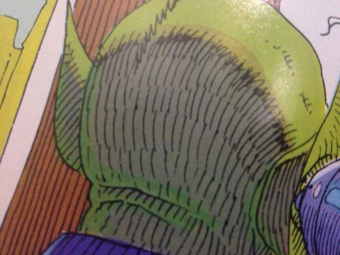
The textures help to hide the flaws and to do a million other things besides. They are, in short, a very useful tool. Textures also provide focus; where there is density of line, so will the eye there be drawn. This can be seen most clearly in Milongiannis' work, when textures will fade from a figure outline to be filled with color only. This is basic drawing and design: creating the outline/silhouette/shape, then using contour lines/further shapes to pop out the insides. Moebius can be seen to use precisely the same technique all over the place, often in how he draws arms and legs, with the outline clearly drawn-in and pen-nib contour-flourishes providing the musculature. Hell, he often used it for monsters too:


This technique is used mostly by Stokoe and Millonogiannis, both of whom use mark making which alternates between delineating the outline of an object and describing the texture of its surface (sometimes with very little discrimination between the two). Graham however does not do this. His line nearly always describes an outline or an edge of some kind. He does do some texture, sure, but 90+% or so of his lines are outlines, edges or strict demarcations. Graham, like Moebius, and in apparent conscious emulation of him, has stripped down his style into a sort of minimalist maximalism. Simple and clear, just as Moebius’ quote dictates.


This technique is used mostly by Stokoe and Millonogiannis, both of whom use mark making which alternates between delineating the outline of an object and describing the texture of its surface (sometimes with very little discrimination between the two). Graham however does not do this. His line nearly always describes an outline or an edge of some kind. He does do some texture, sure, but 90+% or so of his lines are outlines, edges or strict demarcations. Graham, like Moebius, and in apparent conscious emulation of him, has stripped down his style into a sort of minimalist maximalism. Simple and clear, just as Moebius’ quote dictates.
Milonogiannis and Stokoe, while also clearly masters of their craft, have just slightly less experience, and their own tendency to use texture to, as Moebius said, compensate for imprecision, is still a bit obvious on occasion. That ain’t me talkin’ shit, BTW. I love the work of all three of these guys probably more than is wise, and the imprecision of consistency in facial structure, bodily proportions, etc, etc, is not necessarily a flaw, but part of a healthy swing-note to the art. As always with these things, if everything was perfectly on-model, you might as well just use goddamn ZBrush and just take screenshots to make your comic. And it’d look horrible. No warmth of the human hand in error-filled creation.


The errors provide the texture. No pun intended.
Even Graham, whose grasp of consistent proportion and scale is probably the strongest of the three, fluctuates in shape structure quite often. And all three have calling card shape structures they stick to, and which they have an excellent, if rather fluid, grasp of. These things are the basic vocabulary of the their visual language. The methods by which they visually short-hand and transform object into icon. The way that Milonogiannis draws thick torsos and muscular legs with tiny feet, the way that Graham draws legs and hands, the way Stokoe renders folds in just about anything, flesh, fabric or otherwise.
All these icon systems are hallmarks of each artist and all cartoonists posses them, and when they’re shifted in size and scale on the page, they often end up a bit distorted just as a matter of course. If you look closely and want to be really nitpicky, everybody’s off-model all the damn time in comics. This is what Moebius’ quote is all about. The textures and detail-buildup help to hide those off-model flaws. As I mentioned earlier the use of shifting textural specificity/lightness of rendering detail is an incredibly useful tool for the creation of ocular focus, though. The eye, by nature, training and habit, goes to areas of greatest contrast.
By manipulating the density of a texture, the artist can therefore create areas of contrast and thus visual interest.

In this, Graham is the most interesting of the three, since his density of line is usually not achieved via the creation of texture, but via the addition of further details into the setting. Object density (and, in Graham’s case, idea density) is always more worth sinking your teeth into than just the empty calories of simple textural density, which carries relatively little coded information within its marks in comparison. Of course, Graham is putting out the comics he writes and draws at rather his own pace, and so can afford to code in a high level of object and idea density, rather than the other two who’ve been basically doing alt-mainstream action comics recently and who therefore have less time to code details into their work or to be so precise about their shape-structures.
What this means in practice is that when Graham draws your eye with density of line, your eye is charmed into staying in the spot to decode the humor or the novelty present at that area of denser information. Come to the spot on the page for the visual appeal and density of line, stay for the humor and character and the coded puns represented by the lines. In Brandon Graham Comix visual density and conceptual density are almost inseparable. Everything means something; everything codes for something. Nearly every line an object; a coded, likely pun-ridden, hidden little treasure.


These artists are not beholden to light sources or rigid rendering styles. The swung note is here in full force; the rendering rules shifting everywhere except outside the bounds of the single width line, the shape-structures of the iconograms, and possibly some (sometimes a great deal of) textures for focus and composition. Very little hard-and-fast lighting rules. Little to no shadow-shape-oriented rendering. All line all the time, yo.
The single width line provides emotional grounding. If the manipulation of a brush line is akin to the violin, able to achieve an almost infinite level of continuous, ever-shifting variation in output and emotional tone, the single-width line is like a drum, hitting a discontinuous, relatively similar note each time, with the timing and arrangement and composition of the notes in relation to one another being the thing that matters, rather than the quality and range of any individual note (read: line) on its own. Only time will tell if the music of all these guys’ compositions will improve enough that they can (assuming they want to) really strip things back the way Moebius seems to indicate. Graham of course, as mentioned earlier, has been in the process of doing just this for quite some time now.
Stick to the composition and the clear reading experience. Use density of line and contoured auto-texture to draw the eye and bolster the composition and the reading experience. Stick to the outline-silhouette-shapes and pop out the innards as necessary. Go go go!!!
Now... color.

Color isn’t essential to reading these dudes and all three have released books in good old black and white, but I think it’s an important thing to address regarding the clear-line texture combination. Coloring a comic considerably alters its reading experience. As Will Eisner said (I think it was him, I believe it’s from Eisner/Miller, I'm probably wrong on both counts):
Colors communicate emotional suggestion. They communicate lighting conditions. They communicate the general feel of a page. We absorb colors like sponges, taking cues and catching feelings; grounding ourselves in the various scenes. Colors are slippery things. Easily misused (just think about how most direct-market comics are colored these days; ugh) and easily misunderstood, they are an art unto themselves; a whole spectrum of relationships and understandings, plenty deep all on its own. And, in the work of our clear-line texture men, the color use is, perhaps expectedly at this point, excellent.
When dealing with clear-line art in general, flat colors are the way to go. Clear line is all about the shapes and the spaces and the visual relationships, and rendering out colors with more than just a tone or two would be absolutely counter to the clear delineation of space desired by the approach. In other words, to quote ol’ Scott McCloud’s Understanding Comics:
The single width line provides emotional grounding. If the manipulation of a brush line is akin to the violin, able to achieve an almost infinite level of continuous, ever-shifting variation in output and emotional tone, the single-width line is like a drum, hitting a discontinuous, relatively similar note each time, with the timing and arrangement and composition of the notes in relation to one another being the thing that matters, rather than the quality and range of any individual note (read: line) on its own. Only time will tell if the music of all these guys’ compositions will improve enough that they can (assuming they want to) really strip things back the way Moebius seems to indicate. Graham of course, as mentioned earlier, has been in the process of doing just this for quite some time now.
Stick to the composition and the clear reading experience. Use density of line and contoured auto-texture to draw the eye and bolster the composition and the reading experience. Stick to the outline-silhouette-shapes and pop out the innards as necessary. Go go go!!!
Now... color.

Color isn’t essential to reading these dudes and all three have released books in good old black and white, but I think it’s an important thing to address regarding the clear-line texture combination. Coloring a comic considerably alters its reading experience. As Will Eisner said (I think it was him, I believe it’s from Eisner/Miller, I'm probably wrong on both counts):
“Black and white books are read, color books are absorbed porously.”
Colors communicate emotional suggestion. They communicate lighting conditions. They communicate the general feel of a page. We absorb colors like sponges, taking cues and catching feelings; grounding ourselves in the various scenes. Colors are slippery things. Easily misused (just think about how most direct-market comics are colored these days; ugh) and easily misunderstood, they are an art unto themselves; a whole spectrum of relationships and understandings, plenty deep all on its own. And, in the work of our clear-line texture men, the color use is, perhaps expectedly at this point, excellent.
When dealing with clear-line art in general, flat colors are the way to go. Clear line is all about the shapes and the spaces and the visual relationships, and rendering out colors with more than just a tone or two would be absolutely counter to the clear delineation of space desired by the approach. In other words, to quote ol’ Scott McCloud’s Understanding Comics:
“ … the masters of flat-color comics are, above all, masters of form and composition.”


So, flat colors, or colors with little contrast to their gradation, and their relationship to form and composition... those colors have to perfectly placed and arranged and composed, just like the shape structures they’re filling. Composition must be adhered to, in both larger aesthetics, and in left-right reading experience. And in any kind of drawing that eschews a good deal of shadow-shape based rendering, the onus is on the coloring to establish a structure of values for the eye to read as "highlighted" or "receded". Anyone who's used charcoal and chalk or painted at all should understand this dynamic. Used in comics with little heavy inks, that composition of light and dark, aka foreground and background, across the whole page is the job of the colorist, since the lighting isn't usually being done by the artist.
I'll be grayscaling pages often here on the blog, just as an exercise in stripping away the glitz, flash, and, honestly, unique palette of a colorist, in order to reveal what they're doing with the experience of reading image contrast. And I'll just toss this out here, since it'll be coming up again regarding contrast and the basic experience of reading images boiled-down-into-purity: manga, son.
So: The right objects brought to the fore, others made to recede, all in combination, in concert, with the arrangement of the composer (read: artist). We could here really dig into the specificities of the palette choices on the part of each (perhaps including Joseph Bergin III, who colors Prophet, as well) and the nature of reading shapes on a page and much more, but those specificities will have to wait for other posts. This sucker’s run long enough.
Graham, Stokoe, and Milionogiannis. The clear-line texture men.
Three of the many children of Moebius; each in their way.


tomorrow: talmbout michel fiffe an' drawrin cities!
Final Notes: I know, I know, there are many more guys out there who
work off of similar rules and who
could easily be called clear-line texture men. My apologies to them for leaving them out; they'll be in next time.
I also neglected to mention the influence of manga and nib-pen drawing in general on the so-called
“clear-line texture” look. There is immense cross-pollination there to be sure. My apologies for leaving it out.
And lastly, I wanted to get something about Sergio Toppi in here and discuss the creation of personal mark-making
set-structures and how Toppi’s personal patterns and textures can be related to Stokoe’s or Graham’s or
Milonogiannis’s, and how all cartoonists tend to develop these. Alas, I could not manage to work this in
organically and so cheated by just writing it out here. Ha! Victory from the jaws of defeat!
Written with many thanks to Brandon Graham, James Stokoe, Giannis Milonogiannis,
and, of course, the invaluable reader, for without whom it is all for naught!
I’m out. Enjoy the leftover pictures!

this isn't moebius or any of the other three.
it isn't an obscure reference or anything,
but kudos to you if you know it!


can you see milonogiannis in any of the moebius panels above?
i can in a couple...


tomorrow: talmbout michel fiffe an' drawrin cities!
thank you so much for reading!
No comments:
Post a Comment