all programming shall henceforth be broadcast from dirtyfractals.tumblr.com
end transmission; thank you for you participation


how to read comics,
part zero point three repeating:
on imparting the delicate art of sight

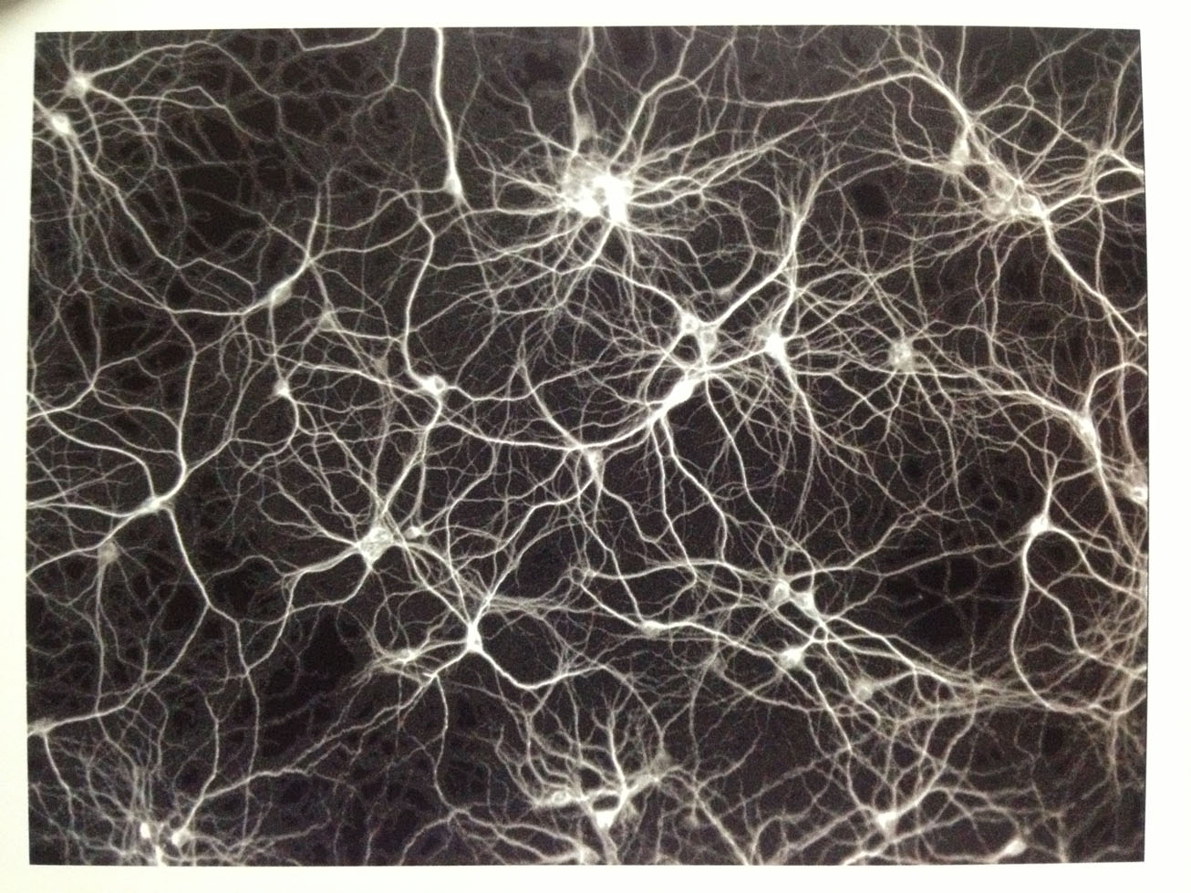
pollock left; simulated nerve structure right
Comics are dying. They've been dying since the form was born, of course. An endless la petite mort of ego death, comics, the art form of the gutter and of the poor and of the unwashed, was and is as the phoenix: forever dying simply in order to survive. Today the direct market and the superhero have cannibalized themselves down to nearly nothing, vampiricly sucking away at the readership and the artistic potential in order to grub more money from the addicted geeks and the movie-going mainstream (oh capitalism, you scamp you!). And while people have been predicting the death of comics for as long as they've been around, and will continue to be quite wrong in such predictions, the times, as ever, are a changin'.
I wrote in an earlier iteration of this column about the so-called "dominant mode" of comics reading and compared it to something like homogenization or gene-pool thinning. And I do still stand by those metaphors. But I do not fear for the medium because of them. I fear for the market, certainly, but not for the medium.
The dominant mode will live on and most everyone will participate in continuing to maintain and enforce its dominance.
And that's fine.
It will endure. Like tract housing, the dominant mode will endure. And similarly, it will all be built the same. Each different enough to fool everyone just a little, but if you squint hard enough or look with just the right kind of eyes: all built the same. Worth to found there in the suburban tract, to be sure; inventive, interesting innovation and design. Clever problem solving. But art... hard to defend the tract as art. Especially if you were raised in Northern California in the architectural experiments of old, retired bourgeois-bohemians.
The form will still flower on in its unique idiosyncratic way, as always, but the dominant mode, the tract, can never be killed now. The dominant mode is comics for 99% of the people who will ever interact with the medium. Built, operated and thought-of all with little depth. Just a thing to be moved through. Contemplate not, oh reader!
Now, this is where I have to take a step back through all the affectation and hyperbole and say again that that's all fine. Comics don't exist in a radio-and newspaper dominated mass-media landscape anymore and haven't been king of that particular hill for lifetimes now. If you want people to care about and read comics in the year 2013 you have to realize that those same people, in all likelihood, get more than enough entertainment and escapism and cultural involvement from movies video games television shows and social media.
Comics generally do not compare. They're too much work! And not just for the folks who make them! But for the audience! Comics (and static visual art more generally) just require too much active (and rather ethereal, abstract) engagement.
This is where the dominant mode comes in, of course, to engage for you.

As I said in the first iteration of this column: the dominant mode stripped out the inherent graphic nature of the medium to communicate using the grammar of the camera and to so grab the audience used to the same.
And that's fine.
Business as usual. The regular dynamic; the simple jams.
That's not all that we want though, is it? We want more, surely?
We also want to see with new eyes. We want to rebuild the dynamic. Destroy it to save it. Remodel the house, to recall the original metaphor. Let's get back to those load-bearing walls now, my apologies about the meandering. So, the word balloon and the panel. The load bearing walls of the medium. Some of the basic units. But those two things, as with the framing of a house, are in fact built on something stronger and deeper: the foundation. The foundation of the comics medium is the page. Actually, that's not right.
Because there's a foundation to the page too: the ratio.
The ratio is king.

Whether landscape or portrait, infinite scroll or finite single-panel gag, the ratio rules over the medium with an iron fist, inescapable The page and the screen are derivations, transformations, of the ratio. Proportions and their inherent geometries are what power all visual art, and comics are not exceptions to this universal law. Whether tall 1.5 ratio american action comics or 1.3 ratio comics of manga and magazine proportions or long newspaper strip collections and more, the page and its rules are built on the ratios of inherent spatial relationships.
Anyway, most folks concern themselves with the actors and the scenes: the words, the visceral emotional reaction to the art, and the transition between iterations of those two things. Read, glance, read, glance. Prose, emotional tinge of image, prose, emotional tinge of image.
Comics more as illustrated prose experience than as symphony of image interrelation.
And like I've been saying, there's really nothing wrong with that.

But it's not the be-all end-all; it's only one mode.
Faces we're built to emote in response to. And words and language are where our sense of higher self is largely rooted. Emoting in response to those things is easy; natural. It's not quite so natural to do so in response more abstract stuff; to a Jackson Pollock or a Picasso or what have you. "How the fuck am I supposed to react to these splashes of color! Give me something I recognize, goddammit!" This is the dominant mode: Everything you recognize. The usual dynamics. The too life-like, too cold, evocations.
None for me thanks, I'm good. Give me Color Engineering. Give me Lose. Give me Zegas. Give me a dynamic to learn, a unique ratio-rule-set I do not recognize!
Give me a unique home to explore.

And so after awhile of only responding to the surface level, easily-decoded-by-anyone-who-can-read comics experience, the reader builds up a perception of story as wholly separate from the story-telling, when these things are actually so close as to be inseparable. The medium is supposed to be part of the message, you know? The art is the story. Or at least, it's supposed to be. But the quality of visual storytelling isn't what most comics readers come to the medium for. They come to see what happens in the plot and to the characters. The what becoming more important than the how. The end justifying the means. The experience becoming more about channeling characters and voices than about complete visual sublimation into the space of the page.
This is the goal: process the page in every way possible. Complete submersion in the image.
Now, this is where I have to get a little personal again, because all I can speak to is my experience in this little particular. Like I said in the earlier column, my father was a general contractor and I've been on construction sites more or less my whole life. I was running cuts when most kids were just running around. I used to watch houses grow up around me as I did, each beating me every time, skeleton to skin. Growing up in a continuous assemblage of the technological accretion that is the modern american house you learn that ratios, proportions and relationships are incredibly important in construction and architecture.
Hell, they're important everywhere, really, but even the layman should be able to understand the paramount importance of ratios, proportions and measurements in architecture. Whether you're working on the small scale to develop a custom finish trim pattern for a room or rooms, or whether you're working out the spacing of beams on a trellis or designing the basic footprint of a foundation any or a million other things, the aesthetics and interrelationships of the patterns are paramount.
It's difficult for me to put this sort of thing into language, but over time you just develop an eye for proportion and distance and relationship. A practiced accentuation of the brain's inherent pattern recognition capabilities: "That doesn't look quite right, move it like 3/16ths to the left... yeah, yeah, right there, that looks good. The lines match now, see?"

Everyone who's any good at their job develops this sense of harmony with the things they're in charge of, whether those things rely on visual processing or otherwise. And most comics artists worth their salt manage to develop unique rule-sets beyond the dominant mode, creating their own unique visual language. Many do not though. Many create only a surface sheen, speaking the same old action-comics dominant-mode language as ever, only with a very slight filter over the camera. They have not the energy or ability to self-generate a unique visual language. They just play the old tunes in new ways; a tradition as long and storied as it is boring. None for me thanks, I'm good.
So I suppose what I'm saying is that an upbringing in construction and its visual focus and structural rules, has, in a strange and unexpected way, greatly affected how I read comics and interface with art.
I'm not sure if that's an accurate judgement or not, though. It smacks of narcissistic self-aggrandizement to me, and I need to explore it a little more to see if there really is gold in them thar hills, or it's only just the pyrite of ego. Hopefully a little of both.
Alright, let's pull together here: Visual art, and architecture and building in general, are built on aesthetically pleasing ratios and relationships which have absorbed so fully into everyday life they have become invisible to us. In comics these have melted into the texture so completely that we rarely address or work with them, despite the fact that everything is built on the foundations of them. The page is the expression of the ratio; the floorplan to the foundation. The load-bearing walls of the panels and the balloons are built atop the foundation according to the floorplan, etc, etc. I'd stretch the metaphor out to breaking point here, but I kinda already snapped and broke it about a thousand words ago, so yeah.
I dunno if I'm making any sense with any of this, but it's about seeing all the perspectives on the process and understanding the through-lines that govern the systems. Whether those are architectural design languages or visual compositions of pages, posters or anything else. It's about making the patterned connections and aligning elements with the pattern or setting them in opposition to it.
Alright, so, two thousand words into this damn post I'm finally going to get to the point, here: How to Read Comics. You read comics (and static visual art at large, really) by visual networking. I just made that term up, but let's run with it.
rat neurons
We're going to do a little thought exercise together, here.
Look around at the room you're in. Take it in. You're probably already familiar with it, but go ahead anyway. Then close your eyes and try to remember the space. Not the colors or the objects or the light sources, but the spatial relationships. Think almost in wireframes. Now zoom out a little. Imagine the next room or the hallway. Zoom back in on the room you're in. Zoom out to how much of the whole building you're in that you can manage to spatially recall.
And can you do the opposite? How well do you know the shapes and relationships of you own body? The organs and the systems?

Anyway, I may try to do that at some point, we'll see. Maybe when something notable releases and I can get in on some of its early zietgiest. Maybe I'll do video annotations of Copra#3 or something.
Trackable Floating Point Icons - In comics: the marks on the page and the inverse negative spaces implied by the marks. Often constructed with respect to recollections of real-world experiences. In art at large: the shapes within the ratio of the canvas or poster or what have you.
Fluid Visual Network Analysis - The internal process of connecting and aligning singular or multiple floating points within an image based on similarity of shape, color, alignment, scale or just about any other criteria. The continuous comparison of ratios; the reading of images.
Try to recall all the interlocking shape-structures in your head. Do your best. This is practice. You are exercising your spatial processing abilities. And lest you think I'm being unfair: I am. You need considerable practice to be able to do something like that, but make no mistake: any artist worth his or her salt should be able to do such a thing just by closing their eyes and thinking about it. They take in the structural rule-sets as just another language to be spoken. And hell, you could do that planet-level zoom-out in eight panels of comics if you just laid out your beats right.
The point is to learn to see all the perspectives from within your own. To integrate all of the viewpoints available to you within the system. If you're a comics reader the idea is to filter that image in every way possible. Those image rollovers I do here? All that stuff and more should be happening upstairs in the heads of every comics reader just as a matter of course in the reading experience. The reader should be visually networking the icons simply as a part of the interaction. In fact, I would be such an aesthetic Nazi as to say that the visual networking of the icons is actually the real and true comics-reading experience.
So, what do I mean by that made-up term? Well, nothing too concrete unfortunately. Yes, I can say to do all the image-rollover-bullshit in your head or whatever, but that's not particularly useful advice. We're in very hazy territory here, walking across linguistically thin ice. Dancing about architecture; trying to describe in language the mechanics of wholly non-linguistic processes. The better thing to do here would be to record a video or something, where I can point at a comic with a stylus or just my finger and create very clear visual references without the mess of thousands of words of prose just to sum up single images. Just use the compressed time and space of YouTube to give a rambly lecture, complete with visual reference.
Denser information transference, you know?

simulation of galaxies and quasars forming
For now I'll end the column with a few made up terms to ponder and their working definitions (it must be said that there's a whole science of image analysis whose methods and terminology I'm largely ignorant of here):
Trackable Floating Point Icons - In comics: the marks on the page and the inverse negative spaces implied by the marks. Often constructed with respect to recollections of real-world experiences. In art at large: the shapes within the ratio of the canvas or poster or what have you.
Fluid Visual Network Analysis - The internal process of connecting and aligning singular or multiple floating points within an image based on similarity of shape, color, alignment, scale or just about any other criteria. The continuous comparison of ratios; the reading of images.
Alright, that's more than enough rambly bullshit to be getting on with. If you
made it this far, you've my endless thanks and my sincerest apologies.
I'm pretty much feeling around in the dark here, so thank you so,
SO much for sticking with me!
Most images from Manuel Lima's ever-amazing Visual Complexity: Mapping Patterns of Information,
Most images from Manuel Lima's ever-amazing Visual Complexity: Mapping Patterns of Information,
with a single image from Jim Krause's Design Basics Index I trust you can figure out which image that was
mapping comics 004
sailor twain; page unknown


Five basic beats, two above, three below. It is a simple and effective layout, not about action or movement, but about mood and feel. And all you need for that is just some space and the barest bit of tension to release into the space, not grand panel experiments.
To properly divine the tension in the layout here, we'll have to return to the ol' swing-note and the idea of patterned reactions to established dynamics. If there is no hard and fast grid to be the back-beat of the comic (3-Panel, 4-Panel, 6-Panel, 8-Panel, etc) the it's up to the artist to establish a rhythm on each page. Each approach has its pros and cons of course and there's a hell of a lot of grey area, with folks using a grid as a back-beat and then swinging the gutters and panel sizes a little here or there to create variety.
(Dig out your old THB issues, boys and girls, Pope mostly uses a heavily swung 8-Panel grid there. We will return to this in future.)
(Dig out your old THB issues, boys and girls, Pope mostly uses a heavily swung 8-Panel grid there. We will return to this in future.)
So, what does Siegel establish here? And how?
All these things: the square made by all three tall panels together, the wider than average gutters, the lack of alignment or resonance in the panel widths, and even the height of the panels in the top tier in comparison to the width of those in the bottom tier, combine together to almost make the layout shake.
And that's before the compositional elements are even introduced.
There just so many ways that the page can be visually interpreted. The image hardpoints are intertwined so deeply that you can latch on to any of the icon-structures and network your eyes across the image in an infinite variety of harmonious ways.

So many inversions, so many dynamic relationships; yet such simplicity.
Alright, I'm gonna run through the rest of this quick here.

The first panel has considerable depth, suggesting even mountain ranges and a second ship in the background, but the use of heavy values removes a range of gradiating contrast and so suggests far less depth in the foreground. These heavy values with lack of smooth gradation also contribute to the creation of a heavy hinge and larger upper black shape to act as the visual anchor of the page. This first panel also introduces the first two of our only three trackable floating point icon structures: the steamboat and the rain.
The steam from the steamboat also noticeably "cuts-in" the corner, aligning with the curve of the circles-in-tension; and the shape of the steamboat itself even aligns wavily with the mountains in the background and wavy lines of the water in panel two.
The steam from the steamboat also noticeably "cuts-in" the corner, aligning with the curve of the circles-in-tension; and the shape of the steamboat itself even aligns wavily with the mountains in the background and wavy lines of the water in panel two.
As always, there's more to be said about that first panel, but that's most of it.
Second panel.

The beginning of the chorus of the piece. And also introducing our last trackable icon (the water) which itself actually continues the wavy line describing the boat and the mountains from the first panel. But the wavy line describing the boat and the mountains is not the only bridging element between panels one and two, there's actually the rain as well, which falls across the two panels (and the fourth as well) as though the gutters aren't even there. The rain appears in panels three and five as well, but swung in panel three and altered into a wholly different icon in panel five.
The chorus of the rain only beats out consistently across the first, the fourth, and here, the second, panels.
There's even a subtle depth to panel two here, with the both the closeness of the wave crests and the darkness of the panel itself increasing the closer your eye gets to its top.
The chorus of the rain only beats out consistently across the first, the fourth, and here, the second, panels.
There's even a subtle depth to panel two here, with the both the closeness of the wave crests and the darkness of the panel itself increasing the closer your eye gets to its top.
Alright, third panel.

That's contrast at work.
The rain inverts its angle so as not to slide the eye out of the page with a too-dominant angle. The "water" is left light and empty to not pull it too close to the eye, out of the heavy contrast dynamic, past the figure in the foreground. This same lightness contributes to a sense of shifting time and place and weather when the boat icon is read in the panel, since the last time we saw the boat, it was surrounded by darkness, not lightness.
Then there are the strange little raindrops-hitting-the-water marks that only appear to the right of the dock. Why make the marks only there, when the whole scene is rainy?
Well, I will tell you why: Composition.
If those marks weren't there or were everywhere, or even slowly faded out or appeared to the left of the dock or whatever, the eye would then be pulled into all the wrong places. If that space was empty, there'd be a huge hole where there shouldn't be. Your eye would get stuck right there in that trapped little corner. There had to be, at the very least, textural busy-ness to fill that compositional space. Oh, and the angle of the dock and the woman on it are echoed with the column and railing in the last panel, both of which are part of larger alignments within the page.
But you knew that one.
But you knew that one.
Fourth panel.

This is where the chorus comes back and where the page is completed. This is the panel that everything rests on. It has the most depth by a considerable margin, with the "camera" right down close-in on the water and the mountains looming over us in off in the misty distance.
Heavy with the weight of accumulated association and existing within a non-linear, mood-oriented page, this panel is our true reading experience. It's the middle unit, literally. With no progression of actions or even (since it's on a blog) placement within a sequence of pages, the context shifts. Out of a Western-trained upper-left to lower-right reading experience and into single-unit art. This page, while quite clearly comics, demands to be read more like an etching or a block print or a silkscreen. I know I've digressed horribly, but that middle panel, like the same chorus panel I pointed out in Mapping Comics 003, is very important.
Panel 4 here echoes other panels in the dictionary of the page with the rain, with the water, with the mountains, with the wide range of values, and with the very placement and alignment of the panel within the middle of the larger piece, the top of the mountain and the circle of the raindrop hitting the water acting as the top and bottom of two shallow pyramids.
Not coincidentally, Panel 4 is also the widest of the panels in the bottom tier.
Now, fifth panel.

We go from a panel of deep depth of field and detailed close-up, immediately to a stark middle-ground silhouette. We go from space and expanse and a sort of hazy warmth to an elimination of space and expanse and a cold barrier. And our larger alignments and shapes are respected, of course. At the bottom, the railing fits the line of the water down to the impact of the raindrop and above the roof continues the line of the clouds towards the mountaintop and the other tip of the imaginary pyramid. The background is also heavily ambiguous and patterned to so as not to echo with the lightness in the panel on the far left of the tier.
As always, I missed rather a lot in the image.
Thanks for reading!


mapping comics 003
copra issue 2; pgs 4 & 5

Copra #2, Pages 4 & 5; buy it here
I just couldn't ignore this spread. Like a moth to the flame or Icarus to the sun with this shit, seriously. This particular Copra #2 spread isn't the most flashy or exciting of the comic, but it has a wide range of visual progressions and shape echoes and choreographic tricks, and so is perfect to explore through the lens of pictorial mapping and analysis. As always with these posts I'll throw some quick notes and visceral reactions in here at the top and then move in closer for further examination. First, Fiffe has shifted away from the euro/manga ratio of 1.3-ish back to the american mainstream ratio of 1.5-ish, presumably because Copra is an american action comic, not a personal anthology comic, and because that format and ratio slot into existing direct-market tastes with much less friction.
I'll bet if you could visit the production area of the print shop where it's made, though, you'd find page-cut-offs from larger 8½x11 paper (11x17 paper, actually) that's been cut-down.
Just another quick note on ratio at large here, that actually I think Frank Santoro may have mentioned in his TCJ or ComicsComics posts at some point, regarding a weird maybe-coincidence in the relationship between 1.3 ratio pages and 1.5 ratio pages. That being that a double-page spread in a 1.5 ratio comic, if turned on its side, can actually be seen to be at more or less a ratio of 1.3 for the spread at large.
The inverse is also true: take a 1.5 ratio comic, turn it on its side and open it wide, and you'll see that you've got about the 1.3 ratio page.
Click for larger view:


Strange stuff.
I'll try to come back to it in another post at some point, as I think there's something interesting in that relationship to be explored. And lastly, lest you think page ratios somehow do not matter, ruminate on some of the ways the widescreen 16:9 shift changed film-making, and then get back to me.
no rollover
So, the spread as a whole has the usual upper-left to lower-right motion, with the corners that are tangent to that motion isolated from it in order to preserve the upper-left to lower-right energy flow.
And in this case the upper-right happens to be more isolated than the lower-left, but both are considerably isolated from the standard upper-left to lower-right energy that powers the spread at large. There's a nice little visual eddy in the upper right-hand block, and the whole is broken into four note-swung, further-subdivided quarters. Our strong initial visual hinge is back, which is itself inverted in the opposite, lower-right corner, we also have the usual (in 1.5-ish ratio comics) vesica-piscis-powered circles-in-tension, and there are, of course, the usual line and shape structure echoes all over the place.
There are less color echoes than usual, compared to Zegas, probably due to decreased production time and increased page output. The color used in the spread here is quite sparse and mostly is there to contribute to the creation of general fractal shape-density and a grounding "X" across the spread.
Now, the basic quarto/octo-based panel structure:

Several patterns should be crystal-clear at this point.
The spread's top quarters are based around simple two-panel closure/progression, the bottom quarters double this and are based around four-panel closures/progressions.
All slightly swung so that everything feels loose but coherent; patterned but not coldly, mathematically perfect. I guess I'll just go a quarter at a time through the spread, considering they're mostly self contained, here. Though there are places where Fiffe's shape-words reference other shape-words in the visual dictionary of the spread, wherein the visual references move across the quarters, and there break with the self-containment.
Actually, there's really only one place where that specific cross-quarter, self-referential, visual-dictionary shape-communication occurs, but that one occurrence is actually what makes the whole spread work. Without it, even with all the other geometry and layout, the spread would still be a failure. We'll come back to what this magical element is and why and how it works a bit later.
For now: quarters!
And this is The West, so, of course, upper-left first.

no rollover
The hinge of the page: a nice little dry-brush pelican-smudge black-mark to anchor the eye.
From there the ley lines of the page direct the eye in two directions: either up along the lines of the of the docks and the ship or down along the bed and sleeping seaman. And if you do happen to take the higher road up towards the top of the page, Fiffe pulls your eye back down with the sleeping sound effect and, more subtely, the continous color hold of blue across the gutter. The bottom angle of the window (and thus the blue color-shape) evens conform to the same broken-perspective angle of the bed, continuing the eye-line and upper-left-to-lower-right energy.
That same left-to-right energy fits into the larger structure of the page itself, which, despite eddies and isolated corners, still has a very clear "X" composition undergirding it.
The upper-left to lower-right slant-shape is even echoed in the sitting pose of our green-clothed female black-ops recruiter; the shape and proportion of the pictorial triangle made by the pelican mimicking her in miniature. Also, do her clothes here remind anyone of The Long Tomorrow or other Moebius work? Maybe it's just the hat... Anyway, these similar shapes read similarly to the eye, providing a smooth, non-linear, compositionally-based image juxtaposition/transition for the reader.
Whether they mean pelican or woman, the shapes have a similar spelling.
A similar drawing.

The shapes rhyme.
Iterative shape echoes, branching outward from the hinge, in fractal fashion. But something has to be our swing-note, our exception that proves the rules. Our swing-note, moving almost-tangent to our dominant energy, is the boat-dock-sea combo.
And it's the most important element of the composition.
It's the magical element that I mentioned earlier.
Invert the energy of that boat-dock-sea combo to move with the larger page flow rather than against it and the eye would simply slide right out of the panel. The whole thing would tilt over one way, far, far out of compositional balance. Some element of symmetry always oh-so-very-necessary. The swing note of the boat-dock-sea icon-combo will itself be swung later on in the spread, inverted onto itself and echoed back, repurposed as the chorus of the piece. It'll be echoing on again in this bit of writing as well, returning to provide, on a number of different levels, symmetry, grounding and perspective, once we've managed to make it all the way to the final portion of the spread.
Alright, so, that's the first quarter, the first movement, the first call and response, the first basic unit of the whole page's macrocomposition.
Let's review: we've got an immediate establishment of a left-to-right diagonal energy (which fits into a larger "X" across the whole spread), a strong contrasting icon to open the page, a color-shape that spans gutters and whose shape fits the larger diagonal energy, a set of pictorial triangles whose shapes rhyme for easier reading, and a tangent element to be our swing-note, and later, our chorus, and which is the magical element that the whole page rests on.
Oh, and if you look down toward the bottom-left of the quarter, the table with the peanuts is on the same inverted angle as the boat-dock, and is additionally at opposite angles with the table over on the opposing side of the panel.
Echoes, inversions and reflections everywhere.
Now, next movement.

Even here in the one-quarter zoom-in we can see the geometry holographically scale-down to hold the quarter together. The eye has comfortable paths to travel across all the live areas of the page segment. All the layout rules adhered to even down to the small scale.
The quarter is built of two basic beats, one of which is considerably more subdivided than the other. The undivided one on the right is also the only panel on the entire spread to span the whole of a vertical page quarter. That panel is the swing note of the layout, the thing that stands out in order to bring the rule-sets of everything else into sharper focus.

I'd like to further zoom in on the quarter-of-the-quarter here and examine the mechanics of that little three panel choke-and-cough motion, because there's another hinge hidden there, I think. It's one of the basic rhythms of storytelling (and kind of of the universe at large) to establish a dynamic and then invert it, and that's absolutely what seems to be going on in this little quarter-of-a-quarter portion of the larger spread.
Fiffe takes two panels to establish the one-two of the peanut-into-mouth and moment-of-realization head-icon views, then doubles the size of the icon and shifts the angle of the head by 90 degrees around an imaginary fulcrum within the page space, tangent to the angle it was previously at, and coinciding with the forward motion of the head within the scene.
Some of the most basic mechanics of comics storytelling, with the transitions here, and yet many comics don't even bother with techniques such as these across a whole page, let along a quarter-of-a-quarter of one.
Skill and brio, yo.

Two small beats off to the left, one big beat off to the right.
Two half notes and a whole note.
Dun... dun... DUN!
It's just basic visual rhythms, holographically encoded. As above so below; fractals; visual self-reference; etc, etc.
Next movement.

Because even though I've been selling it that way, it's not really a wholly divorced, isolated little entity on the page. It still fits with all the usually patterns.
It's got a hinge, it's got left-to-right energy, it's got eye-movement to in-panel-movement correlations. It's got the standard holographically compressed "X" across the main of the quarter-composition, and it's got at least three trackable floating-point-icons which allow for a very broad range of visual network interpretation (you'll have to wait for the next How to Read Comics post for a proper explanation of that one.)

It is a perfectly composed little visual symphony on the page, a miniature fortune of interpretive graphic information.
Next movement.

no rollover
This is simplest of the all the quarters, yet it's also where the chorus rises up again and where the symmetry of the larger composition is echoed and completed, and where the quality of the piece is ultimately tested, and found to be worthy.
We've got two panels of of the same held shot (get it? see, he's being hel- never mind...), with the echo/chorus/inversion/reflection of the page's larger earlier establishing shot between those two panels, and with a close-up eye-sliver to contrast the visual zoom-out of the chorus's return.
We've got two nigh-identical beats, a returning chorus and an inversion of the chorus's zoom-out idiom to end things.
And as I've been saying, without a reminder of where we are in the larger spatial sense, the page would fail. We'd have been in too close, the feeling too claustrophobic. After a bunch of action-to-action panel transitions, with only the slightest of pauses for the glasses-reflection panel, the page needed to breathe.
To decompress and step back a little.
The inversion of the orientation of the boat-dock-sea icon to face leftward allows Fiffe to kill many birds with a single stone in that panel: The directional orientation, and the color and the structure of the boat-dock-sea icon itself all bring us back to the establishing shot of the whole page; the inversion of icon-orientation allows the first panel to be recalled without off-putting, cold, perfect, precision; the inversion provides the swing. The inversion also allows for the upper-left to lower-right energy to continue all the way across the tier and create further shape echoes across the tier as well.

So many birds.
Alright, as usual, and adhering to the rules of symmetry, back to the large scale at the end of things here, to draw the through-lines and make the final notes. First of the last things: the basic structural tension inherent in the spread's layout and how that tension contributes to the upper-left to lower-right energy of the piece.
As you can see, the left-quarters split just above the page's mid-line (the darker orange line), and the right-quarters split far below the page's mid-line. This shifts the orientation of the whole page into the upper-left to lower-right dynamic, along the line connecting the middle splits of the quarters (the blue line).

In effect, this slightly tilts the mid-line of the page, and the weight of the composition along with it. The eye and mind, natural comparison machines, compare left to right, with the visual "expansion" of the top-right quarter pushing down on the whole spread, further bolstering, via the tension of the layout itself, the dominant upper-left to lower-right energy.
Alright, I think that's it for me on this one. I missed quite a lot; the spread is deeply encoded. But I think I'm a bit better at this. The taxonomies, both visual and terminological, seem to be accreting and solidifying rather well. The efficient methods slowly making themselves clear.
Anyway, this post is really late, and really jumbled, so I might as well just cut the thing here.
My apologies.
Enjoy the leftover images!


written with many, many thanks to the amazing Michel Fiffe,
and of course with many, many thanks to the
incredibly patient reader, as well!
Subscribe to:
Posts (Atom)