
Sometimes I just feel like sharing some strange shit.
This is one of those times.
I'm fascinated by changing ideas of culture. The patterned ways some things always change and others manage to always stay the same. The past is a foreign country and they do things differently there, and history never repeats but it always rhymes. Sigh. You're gettin' this one as fragmented stream of consciousness, folks, sorry. Better Little Books, old world slow media, moving in cycles just like today, but like molasses in comparison. I'm sure it must have all seemed shockingly new at the time. It always does, doesn't it? A whole economy and subculture briefly blooming, like an algae patch in bright sunlight or a flower if you prefer a happier metaphor.
Not unlike the current direct market. The general fate all pop culture, I suppose.
Maybe all culture, actually.

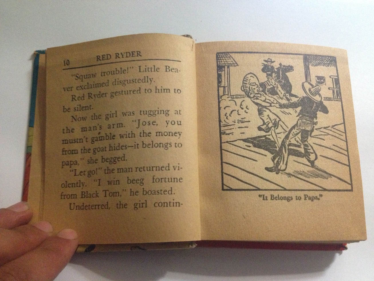
Red Ryder and the Rimrock Killer was published originally in newspaper strip form in 1938, the Better Little Book I have is copyright 1948. As you'll be able to tell from the photos the story is prose on one side and an image with a caption on the opposite, all the way through. Not technically comics, I suppose, but it is an interesting little artifact and the fact that it started out as a newspaper strip is, I think, interesting. There was a whole line of Better Little Books once, including two volumes of Nancy that go for between $30-60 on eBay nowadays. I'm sure they once lined someone's shelves not unlike how manga lines some fan's shelves today. I get a little melancholy flipping through the thing, honestly. It's an anachronism in so many ways. And quite tangibly so. The yellowing, the smell. The dialogue.


And the art, oh god, the art. This thing is 285 pages long and has a brush drawing on every side. And whlie they're quite clearly done quickly, they're also clearly the work of a sharp eye and a sure, practiced, hand. Fred Harman, the artist of the original newspaper strip, appears to have done the art here and that would would explain the obvious craft behind the images. It's a quite charming little record of an era gone by. Plus there are some outright strange panels and completely perfect ones as well. I've got another one of these somewhere that's even longer, and that has a ... bonus feature of sorts to it. Those readers who are familiar with this type of publication will undoubtedly be able to guess what I hint at here. Everyone else will have to wait until I get around to finding it and taking pictures and writing about it.
Is manga the modern equivalent of this? Is there one? For some reason visual novels kept coming to mind while writing this, but I think that's a false association, somehow. Maybe it's soap-operas? Hell I don't know, I'm just fascinated by this weird little thing (it's only 3.75" by 4.5") and for some reason I want to see more weird stuff like it. The infinite-fucking-frontier of digital just isn't as interesting as the hard and fast rules of paper-publishing for me, I suppose. It's too much of a wild west; too open. Sometimes rules provide boundaries, and while that works best when they're fluid and adaptable, they can't be too loose. Not entirely open, you know? I'm far more interested in Oily Comics and Koyama Press, for example, than I am in webcomics.


I wonder how much of that has to do with seeing comics as being more a part of the art scene than the mass-media scene. Perhaps I'm simply stereotyping, but I see the average webcomics fan being more into anime and video games than gallery art or print making. And there's nothing wrong with that or anything, it's just that I wonder about how differing contexts of personal culture effect folk's relationships to mediums. I'm sure there's a whole host more generalizations I could indulge in, but I'm on shaky ground at best here anyway, best to abandon the territory.
I dunno, Red Ryder and the Rimrock Killer makes me think, that's all. This book is numbered 1443 on the spine. Were there that many, or was there some sort of volume system in place? I prefer the mystery of not knowing, honestly. The question being, of course, a more intriguing thing than any answer could possibly be.
More to come.


watch for new stories about them!
